


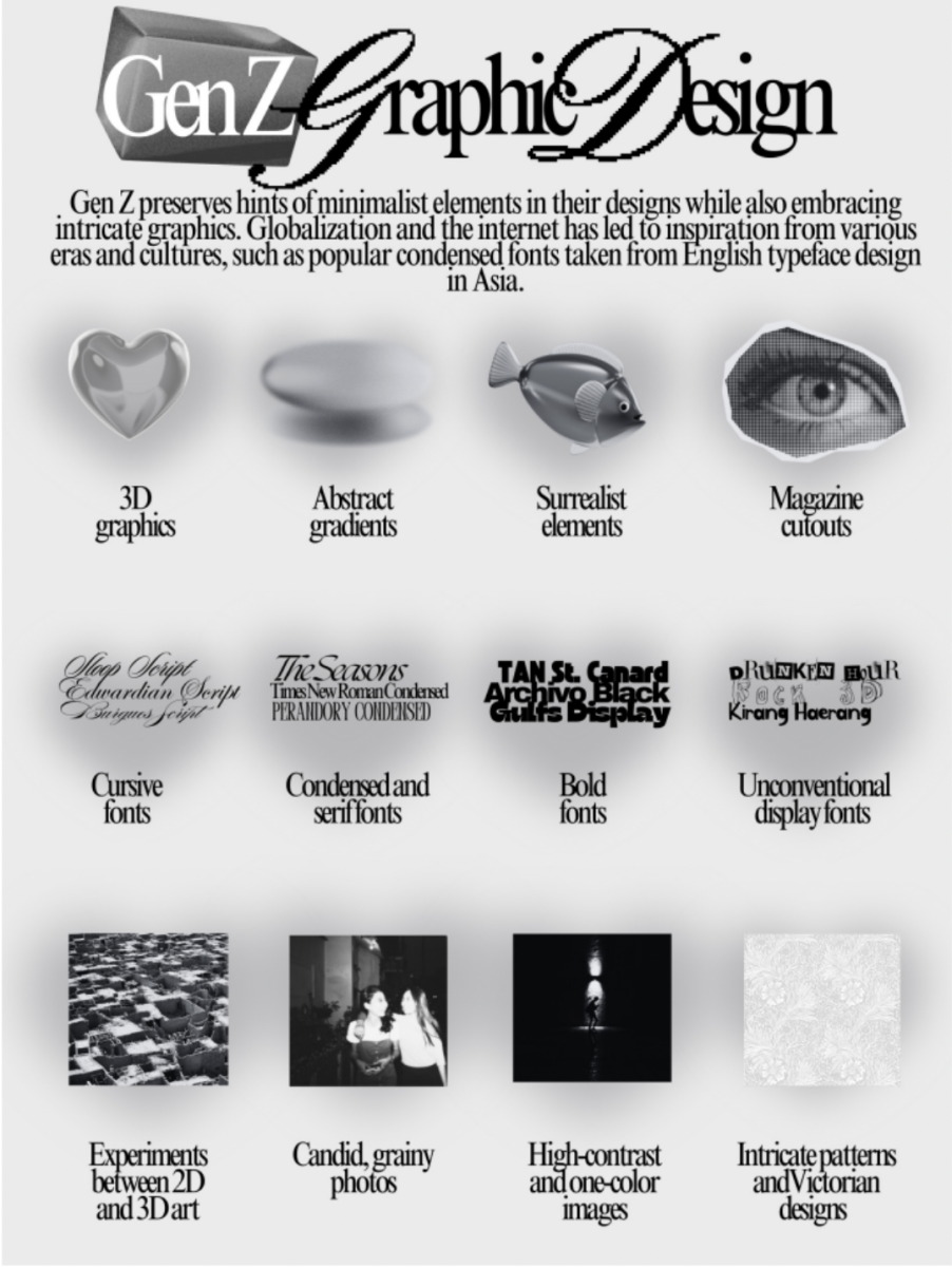


Today, many advertisements targeted towards Gen Z are stuck between hesitant attempts at relatability and the millennial design standard. The financial company Rocket recently designed an ad that reads “we love a queen with a 10-year plan.” The ad struggles to blend its unnatural stock photo and boring typeface with other posts on Pinterest. The mass of brands vying to adhere to this minimalistic standard are widely criticized by design and marketing experts. According to Ryan Duffy, marketing specialist, the style represents “blank placelessness,” and Ben Schlott, advertising journalist, comments that it is, “an identikit formula of business model.”
However, the obsessive discussion on design “blanding” hasn’t considered Gen Z’s gradual hatred of the “Big Tech corporate artstyle.” In her paper titled “Advertising to Generation Z,” Taryn Romaine argues that events in Gen Z’s lifetime such as the development of the internet, COVID-19, the Great Recession, and the stressor of climate change have made them value more authenticity and community within advertising. However, her study does not consider why the millennial designs that Gen Z grew to despise are so simple. Ruirui Fan’s article on contemporary minimalist logos suggests that the style provides stress-free communicative design to navigate the overwhelming amount of information in our world. Millennials were the guinea pigs of early technology and struggled with financial concerns, so they pioneered the soothing advertisements of successful companies like AirBnB.
These comforting visuals aren’t fully despised among Gen Z, with brands such as Crumbl cultivating a popular simple branding style. Alex Piant, ‘27, is appreciative of Apple’s decision to simplify its logo, stating that “though it is no doubt an elaborate, eloquent display of artwork, the vivid nature of the piece is no doubt out of place when one considers the purpose it is trying to serve.” However, Gen Z is also embarking on a separate path that finds itself dealing with the chaos of the world through nostalgic historical designs. For example, the multi-ad “It Starts with a Swipe” series for Tinder features swoops of cursive text, akin to the title screens of classic Hollywood movies, like Casablanca. Gen Z has grown tired of repetitive minimalist designs defining the internet and prefer the colorful design style of old advertisements.
These aren’t the only distinct styles; culture on the internet has diverged from a single, universal view of “what’s popular,” and successful businesses have targeted specific subcultures of Gen Z. Two examples are Liquid Death sparkling water, targeted at Gen Z death metal enthusiasts, and Double Soul socks, aimed towards Gen Z women who like a vintage and introspective aesthetic.
It’s hard to predict what direction graphic design will take into the next generations of Gen Alpha and Gen Beta. Subcultures could continue to individualize advertisement design, or “Sephora kids” and “iPad kids” could prioritize short and intense designs above other values. Ads could also adopt a new form of “blanding,” where bright colors and swoopy fonts start to become overused, and minimalism could resurface as the new “retro.” Regardless of the directions that the next generation will take, the designs that manage to survive shifting trends remind us of the values packaged into our packaging.